Design Challenge
wearable faces design
Improve navigation clarity, support key business goals (ticket sales, donations), and enhance user experience.
Role :
UX/UI Designer
Tools Used :
Figma, Photoshop
Platform :
WatchOS
Design Focus Areas :
Glanceability, Customization & Personalization, Battery & Performance Efficiency, Small Screen Optimization, Accessibility & Readability
mood boards :
To guide the visual direction of the wearable faces, I created mood boards that explore different design themes based on user personas and their lifestyles. Each board helped define color palettes, typography, layout style, and overall tone for the UI.
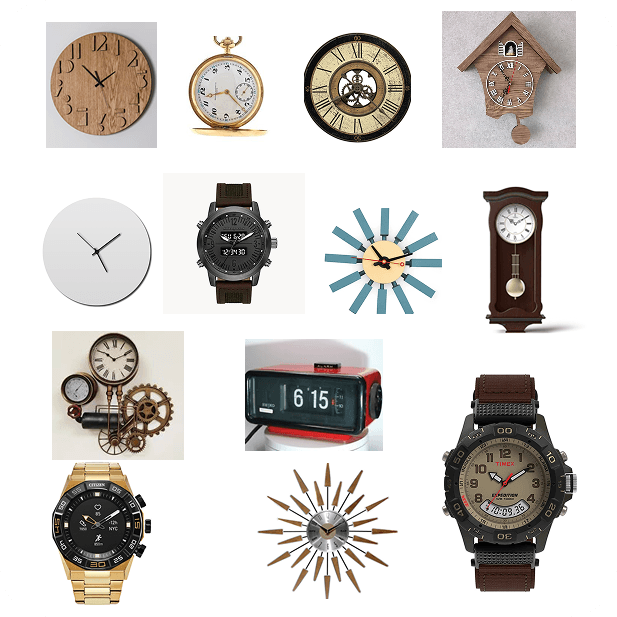
Moodboard 1: Exploring Physical Clock Interfaces
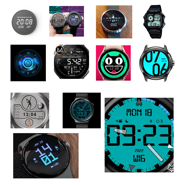
Moodboard 2: Exploring Digital Clock Interfaces
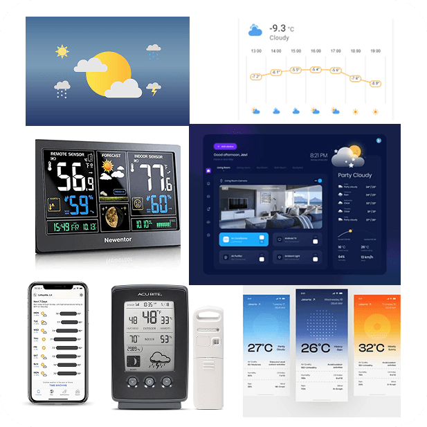
Moodboard 3: Exploring Weather Data Graphics on Apps & Widgets
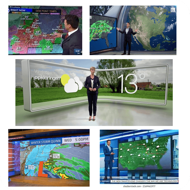
Moodboard 4: Exploring Weather Data Graphics on TV
how it helped :
These mood boards informed the design language for different watch face variants. They ensured consistency in style, supported user preferences, and helped communicate the design direction clearly to stakeholders and developers.
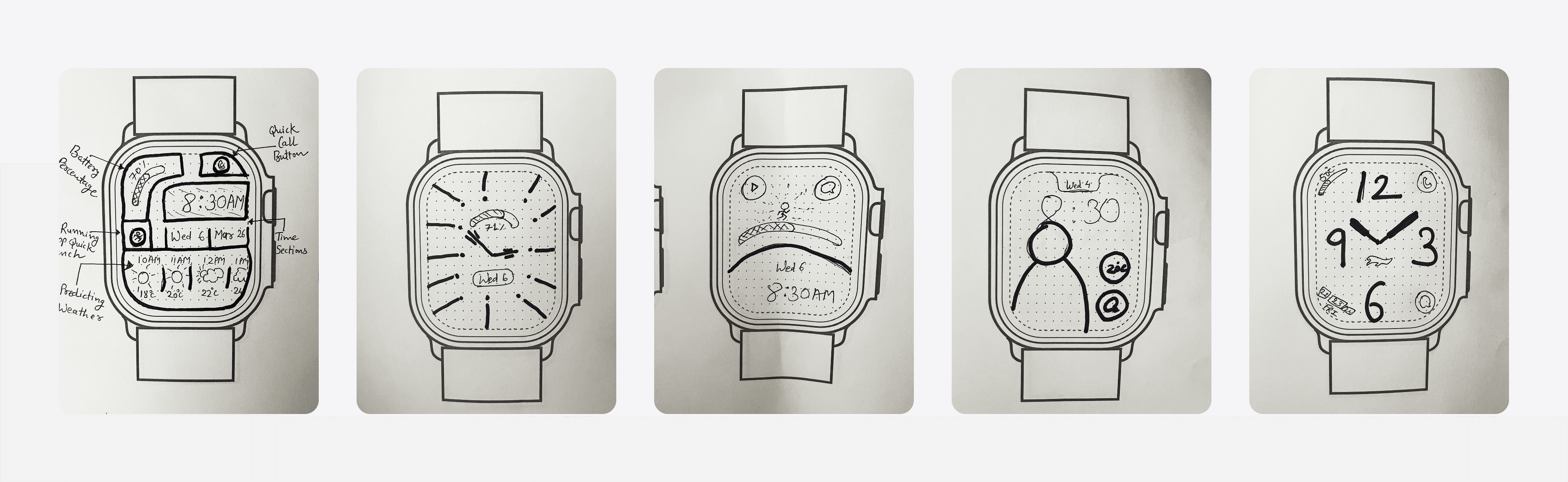
sketches :
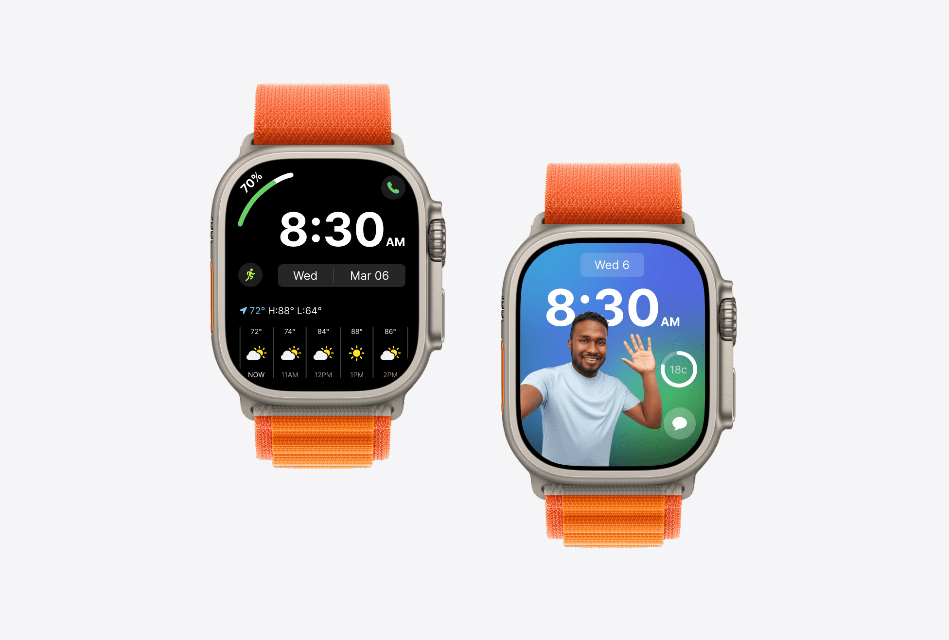
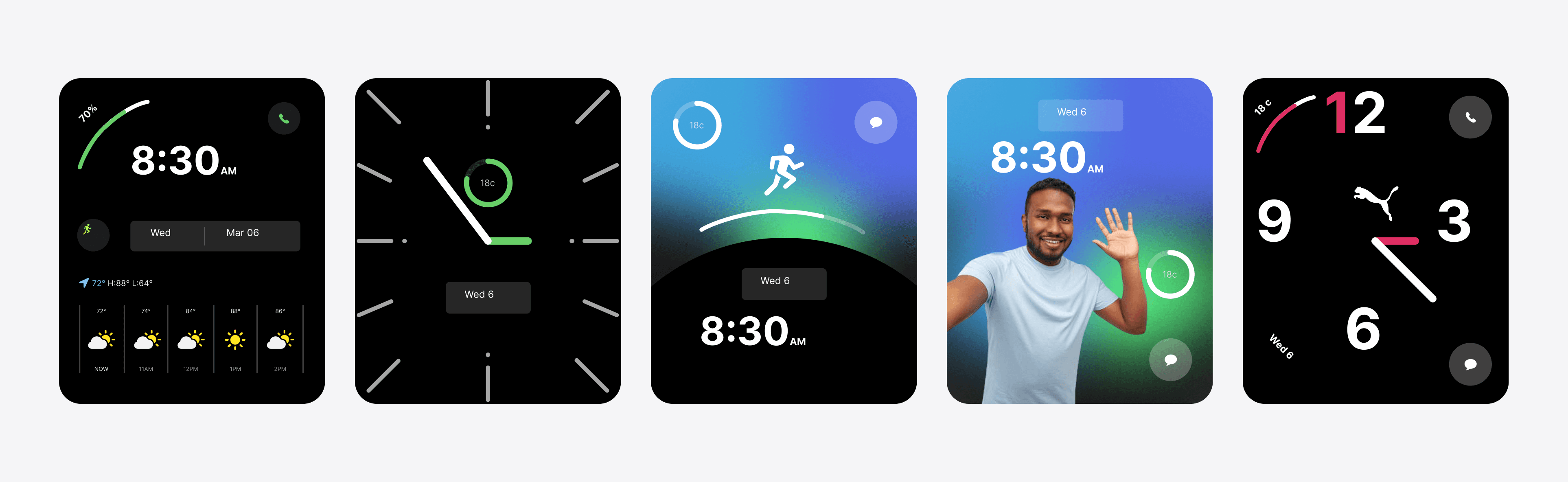
high fidelity :
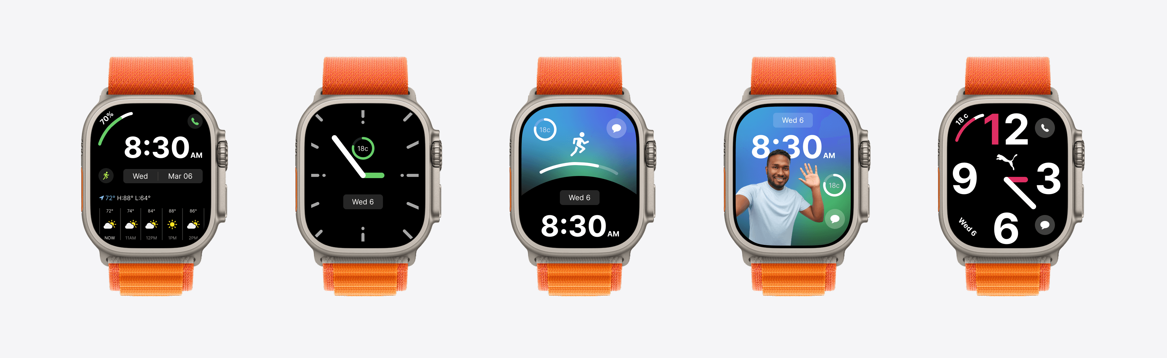
mockup :
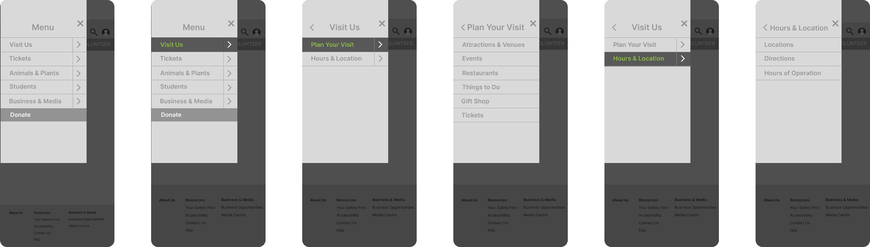
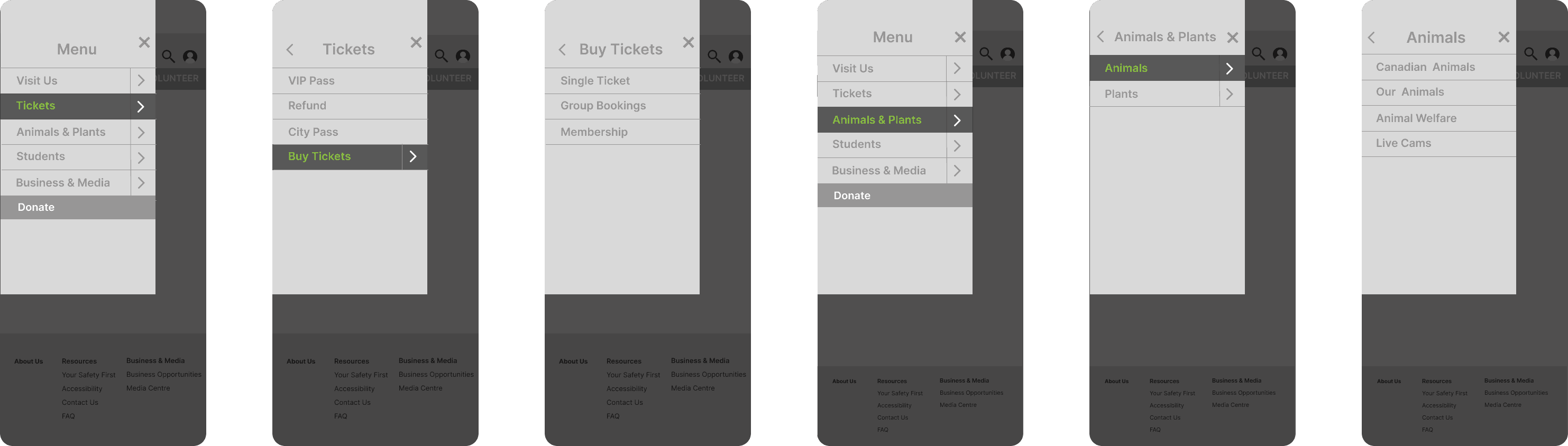
mobile nav :
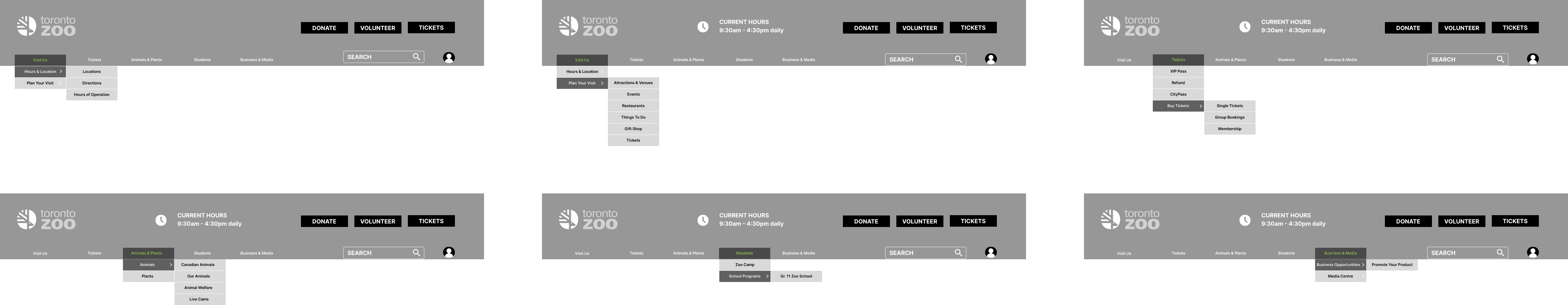
website nav :
what i learned :
Designing for wearables challenged me to rethink how information is consumed in fast, real-world contexts. This project sharpened my ability to prioritize clarity, simplicity, and performance on compact screens.
Key Takeaways:
Designing for constraints builds clarity : Limited space forced me to focus only on what users truly need at a glance.
Hierarchy matters more than ever : Tiny screens require laser-focused visual organization to avoid overwhelming users.
Every pixel impacts performance : I learned how small design decisions affect battery life, responsiveness, and usability.
Touch behaviour is different on wearables : Designing for fingers, not cursors, meant optimizing for tap zones and intuitive gestures.
This project reminded me that wearable design is not just about shrinking interfaces — it's about amplifying relevance and removing friction in the moments that matter most.

Thank you
Let’s build something thoughtful together.
More Projects
Case Study
Humber Current
A celebration of Talent. Humber-Current is platform to build initial connections between students or alumni and industry leading professionals of their domain.
Case Study
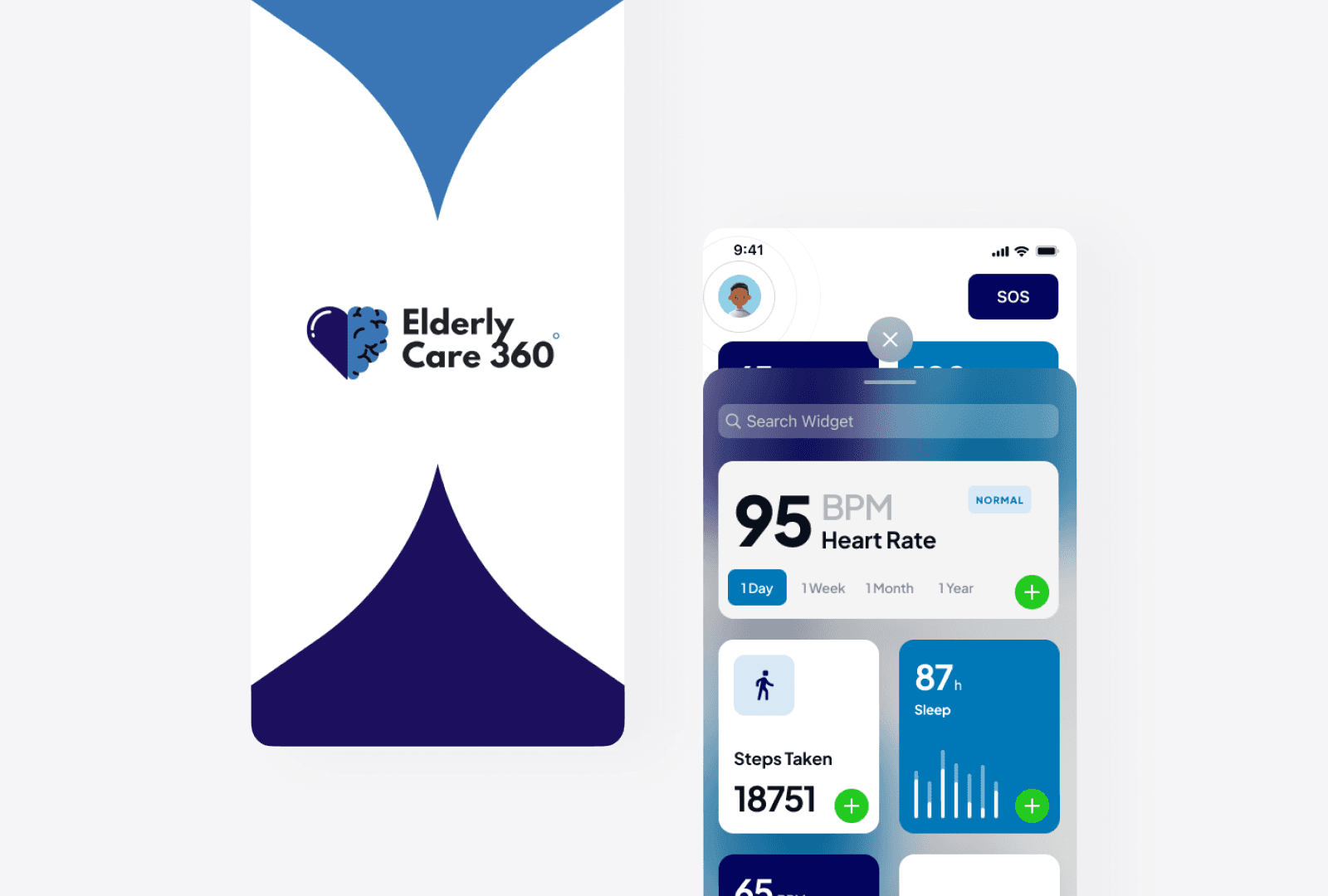
elderlycare 360
ElderlyCare360 is a digital ecosystem designed to support the health, independence, and well-being of elderly users by connecting them with caregivers, doctors, and emergency services all in one place.
Load More
Design Challenge
wearable faces design
Improve navigation clarity, support key business goals (ticket sales, donations), and enhance user experience.
Role :
UX/UI Designer
Tools Used :
Figma, Photoshop
Platform :
WatchOS
Design Focus Areas :
Glanceability, Customization & Personalization, Battery & Performance Efficiency, Small Screen Optimization, Accessibility & Readability
mood boards :
To guide the visual direction of the wearable faces, I created mood boards that explore different design themes based on user personas and their lifestyles. Each board helped define color palettes, typography, layout style, and overall tone for the UI.
Moodboard 1: Exploring Physical Clock Interfaces
Moodboard 2: Exploring Digital Clock Interfaces
Moodboard 3: Exploring Weather Data Graphics on Apps & Widgets
Moodboard 4: Exploring Weather Data Graphics on TV
how it helped :
These mood boards informed the design language for different watch face variants. They ensured consistency in style, supported user preferences, and helped communicate the design direction clearly to stakeholders and developers.
sketches :
high fidelity :
mockup :
mobile nav :
website nav :
what i learned :
Designing for wearables challenged me to rethink how information is consumed in fast, real-world contexts. This project sharpened my ability to prioritize clarity, simplicity, and performance on compact screens.
Key Takeaways:
Designing for constraints builds clarity : Limited space forced me to focus only on what users truly need at a glance.
Hierarchy matters more than ever : Tiny screens require laser-focused visual organization to avoid overwhelming users.
Every pixel impacts performance : I learned how small design decisions affect battery life, responsiveness, and usability.
Touch behaviour is different on wearables : Designing for fingers, not cursors, meant optimizing for tap zones and intuitive gestures.
This project reminded me that wearable design is not just about shrinking interfaces — it's about amplifying relevance and removing friction in the moments that matter most.
Thank you
Let’s build something thoughtful together.
More Projects
Case Study
Humber Current
A celebration of Talent. Humber-Current is platform to build initial connections between students or alumni and industry leading professionals of their domain.
Case Study
elderlycare 360
ElderlyCare360 is a digital ecosystem designed to support the health, independence, and well-being of elderly users by connecting them with caregivers, doctors, and emergency services all in one place.