Case Study
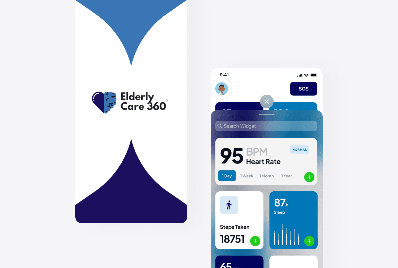
ElderlyCare 360
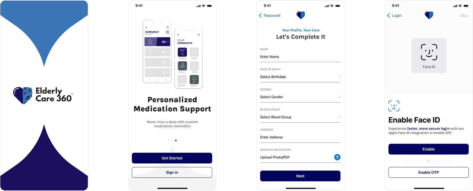
ElderlyCare360 is a digital ecosystem designed to support the health, independence, and well-being of elderly users by connecting them with caregivers, doctors, and emergency services all in one place.
Role :
UX Designer
Tools Used :
Figma, FigJam, Slack
Platform :
Mobile (iOS & Android), Tablet
Design Focus Areas :
Accessibility, Health Monitoring, Medication Reminders, Telehealth, Emergency Response, Social Engagement
Problem :
Aging individuals face growing challenges in maintaining physical and mental health, staying connected, managing medications, and accessing healthcare. Caregivers often struggle with managing care from afar while ensuring the safety and well-being of their loved ones.

Solution :
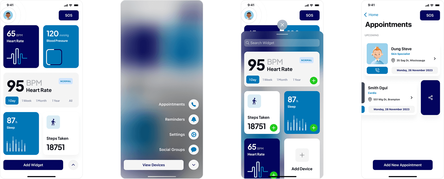
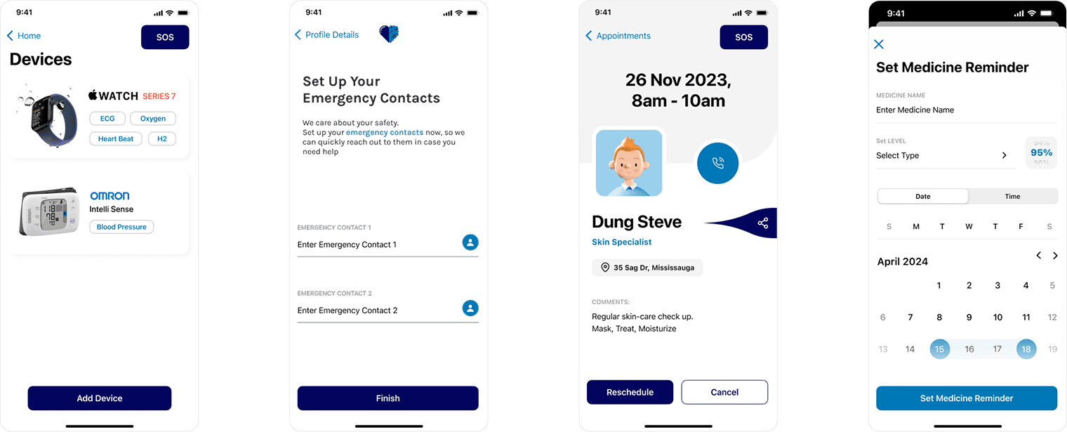
ElderlyCare360 is a comprehensive digital ecosystem built for elderly individuals and their caregivers. It includes health monitoring, medication reminders, virtual healthcare, emergency alerts, and social engagement—all within a user-friendly mobile app interface tailored for accessibility.
Process :
I applied a full-cycle UX design process to create an intuitive and inclusive solution:
I designed with real empathy—testing early, iterating quickly, and building with accessibility in mind to serve one of the most underrepresented user groups.
Research: Interviews and surveys with 30+ seniors and caregivers
Define: Pain points, personas, and user journey mapping
Ideate: Feature brainstorming, IA planning, sketching flows
Prototype: Wireframes to hi-fi interactive prototypes in Figma
Test & Iterate: Usability testing + feedback-driven refinements
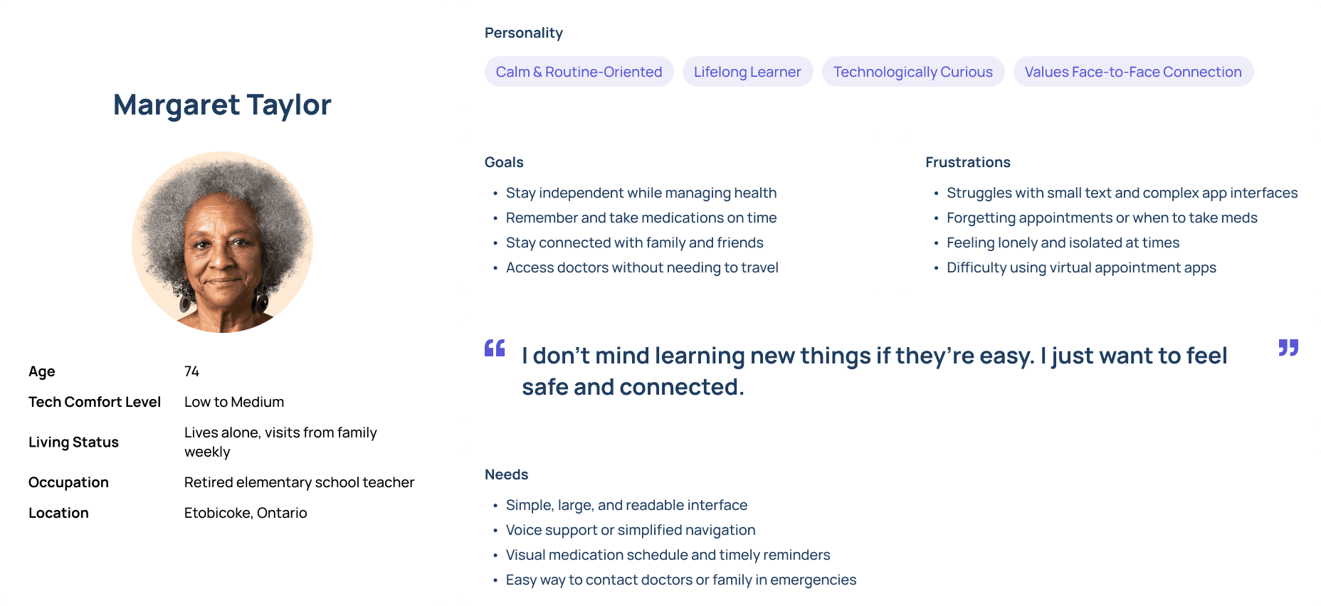
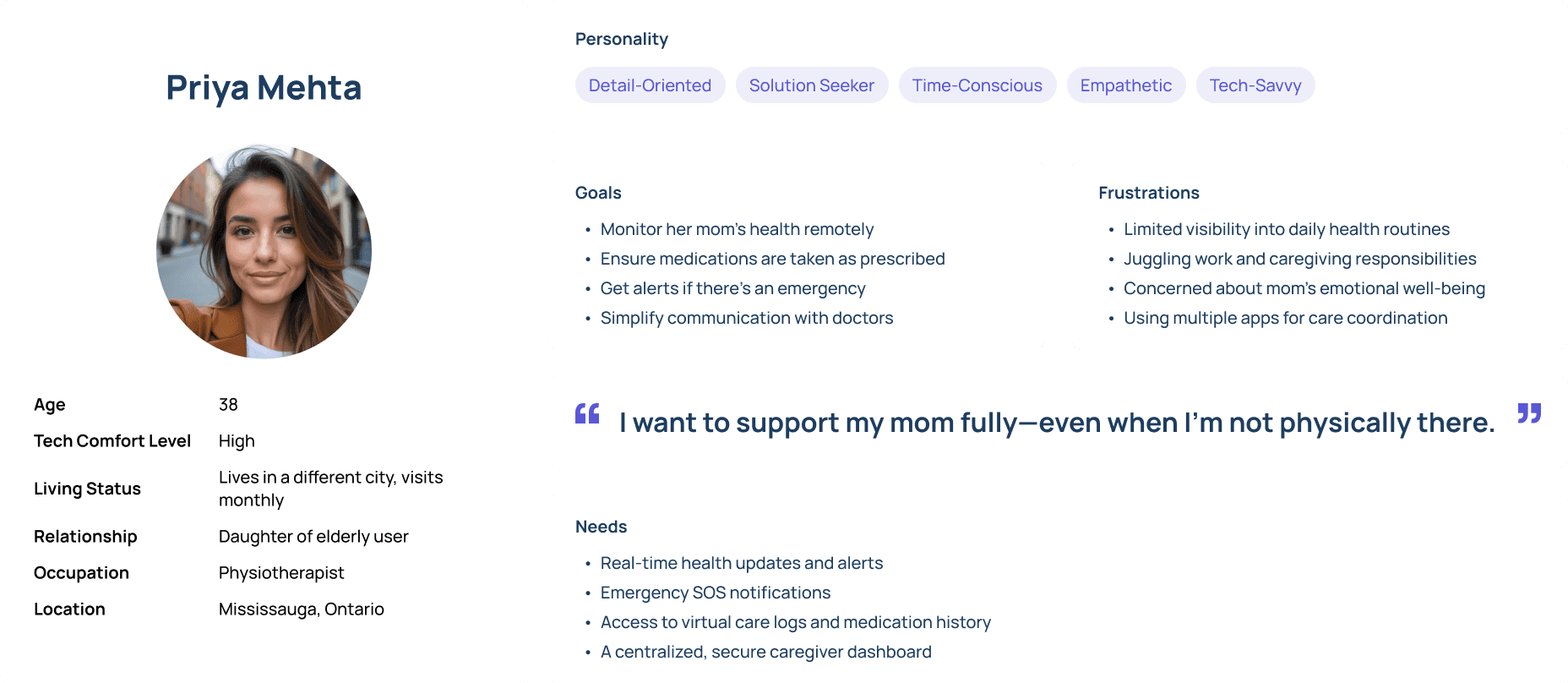
Persona :
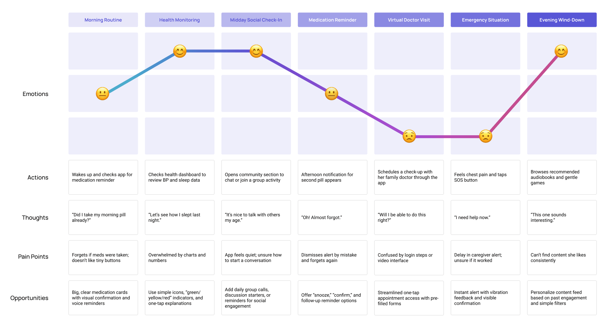
journey map :
Paper SKetches :
From paper to digital :
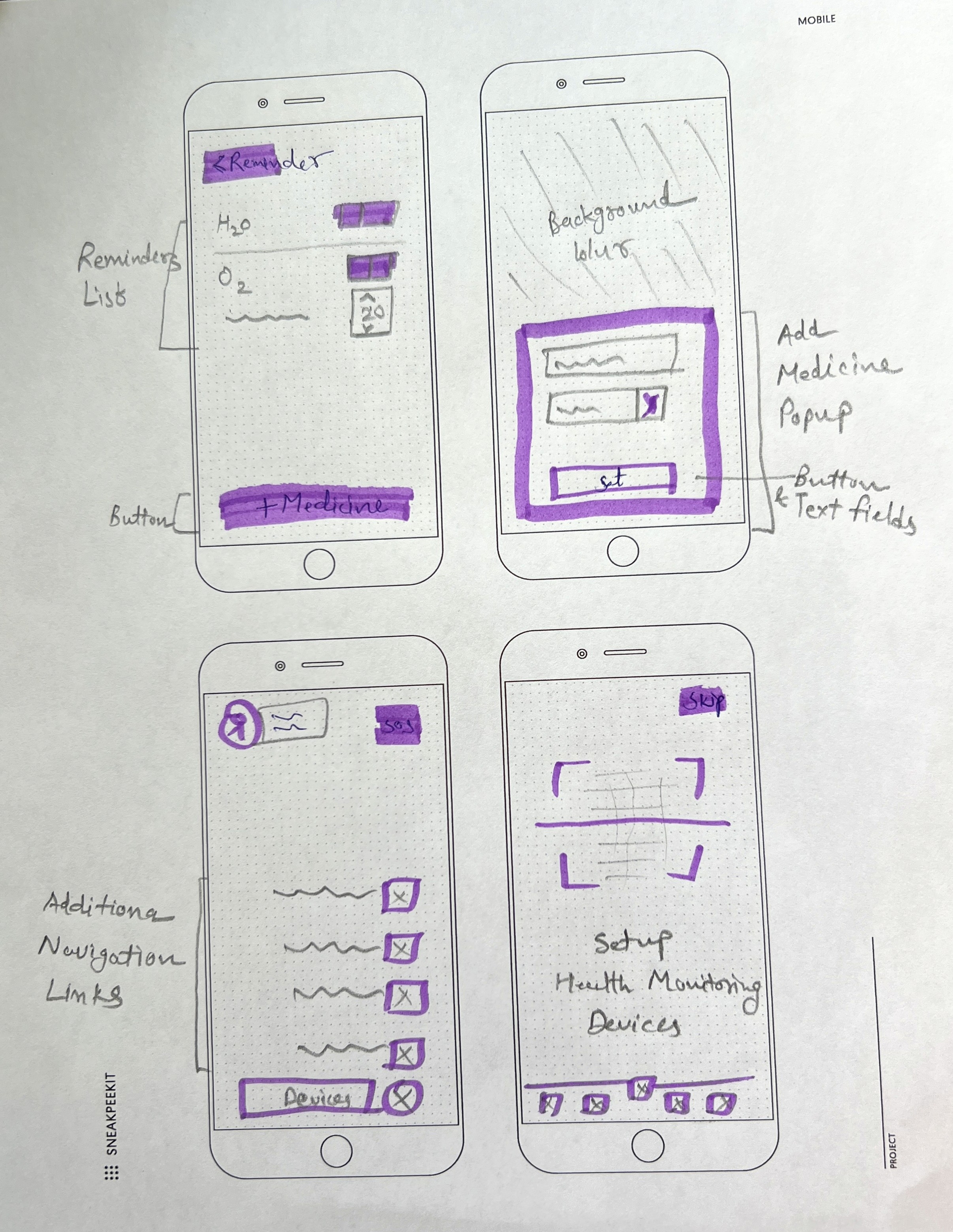
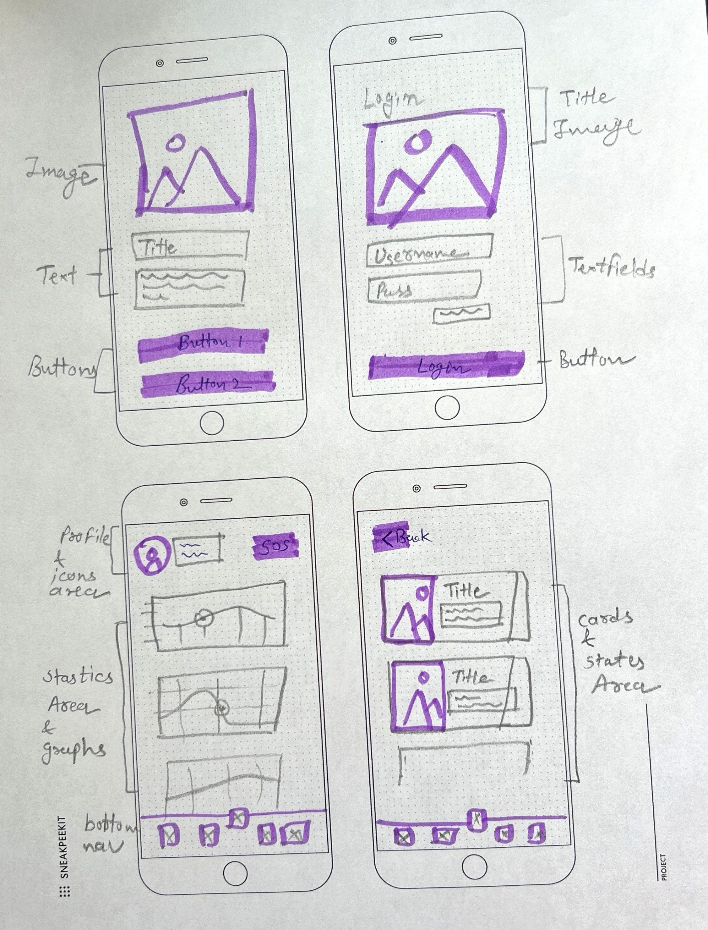
mid-fidelity wireframes :
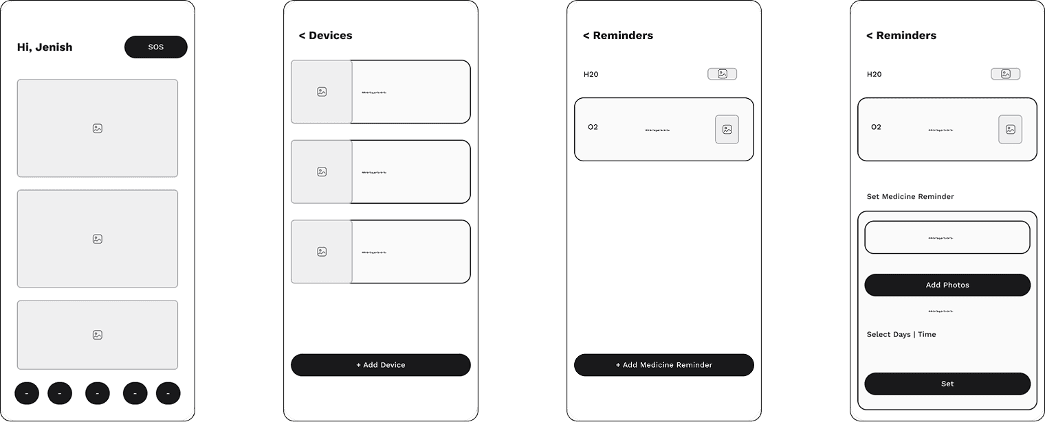
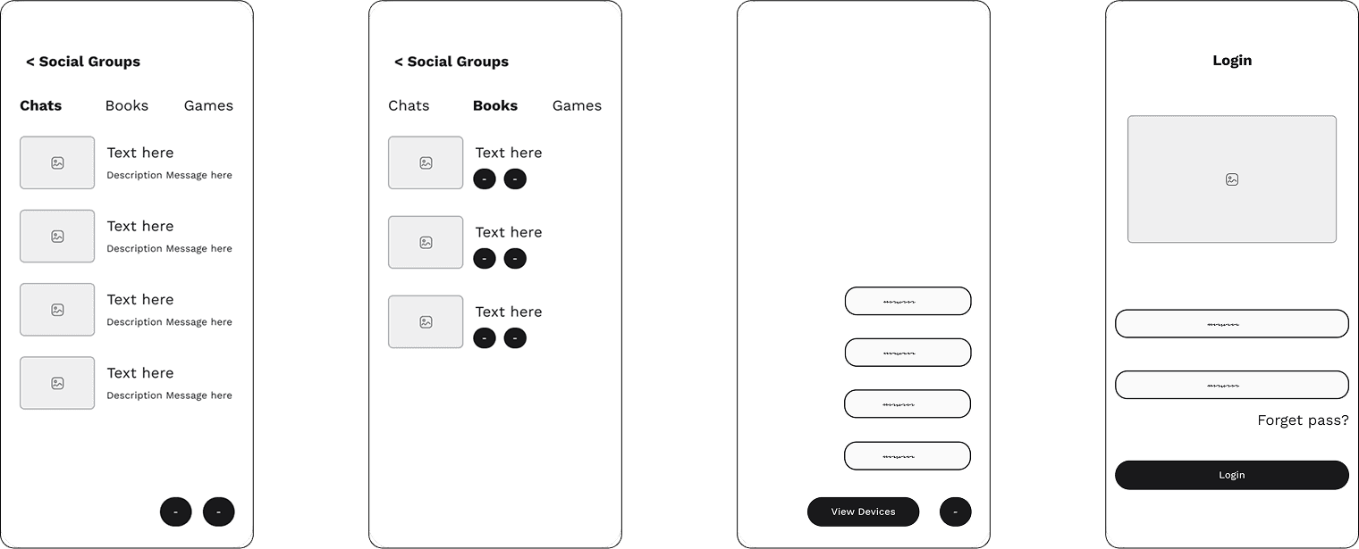
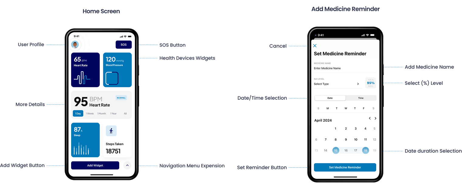
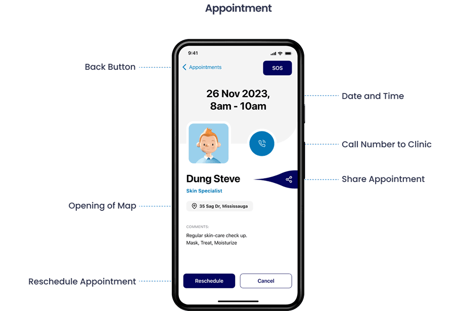
MAJOR DETAILED SCREENS :
Persona :
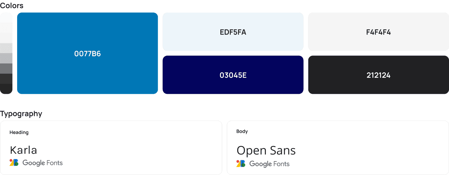
ui guideline :
developer guideline :
To ensure a smooth design-to-development handoff, I prepared a comprehensive developer guideline package. It outlines component usage, accessibility standards, spacing rules, and interaction patterns to maintain consistency and scalability across the ElderlyCare360 ecosystem.
Deliverables:
Design System: Includes typography, color palette (WCAG AA compliant), buttons, input fields, icons, and states (hover, active, disabled)
Component Library: Figma components with variants for reuse and responsiveness
Spacing & Layout Grid: 8pt spacing system and mobile/tablet breakpoint rules
Interaction Specs: Micro-interactions for buttons, loading states, modals, and alerts
Accessibility Guidelines: Minimum 16pt body text, colour contrast ratio ≥ 4.5:1, large touch targets (44x44px), voice support indicators
Assets: Export-ready SVGs and icons, named and grouped in dev-friendly layers
Annotated Screens: Clear notes on functionality, API triggers (for health data), and navigation flow
Handoff Tools
Figma Developer Mode with organized file structure
PDF design style guide
Slack for clarification
app icon design :

testing and iteration :
We conducted usability testing with a group of elderly users (ages 68–82) and caregivers to validate the design, uncover usability issues, and gather direct feedback. Observations and usability metrics helped shape key improvements in accessibility, navigation, and clarity.
Testing Insights
“I like that it reminds me, but I wish it talked to me—I don’t always see the screen.”
“Buttons at the top are hard to reach on my phone.”
“It should be in my language. Not all my friends read English well.”
“The red button made me feel safe—I knew what to press.”
Key iterations based on feedback:
Added Voice Support: Enabled spoken instructions and alerts for visually impaired users.
Switched to Bottom Navigation: Moved key navigation from top to bottom for thumb-friendly access on mobile.
Persistent SOS Button: Made the emergency button visible across all screens with red colouring for quick identification.
Included Multilingual Support: Added options for multiple languages (starting with English, Hindi, and Mandarin) to support diverse users.
what i learned :
Designing for elderly users taught me that accessibility is not a feature - it’s a requirement.
Small details like icon size, error prevention, and content tone make a big difference.
Testing early helped reduce friction and clarify priorities.
Communication between elderly users and caregivers must be seamless, empathetic, and secure.

Thank you
Let’s build something thoughtful together.
More Projects
Case Study
Humber Current
A celebration of Talent. Humber-Current is platform to build initial connections between students or alumni and industry leading professionals of their domain.

Sprint
Toronto Zoo - Nav
Improve navigation clarity, support key business goals (ticket sales, donations), and enhance user experience.
Load More
Case Study
ElderlyCare 360
ElderlyCare360 is a digital ecosystem designed to support the health, independence, and well-being of elderly users by connecting them with caregivers, doctors, and emergency services all in one place.
Role :
UX Designer
Tools Used :
Figma, FigJam, Slack
Platform :
Mobile (iOS & Android), Tablet
Design Focus Areas :
Accessibility, Health Monitoring, Medication Reminders, Telehealth, Emergency Response, Social Engagement
Problem :
Aging individuals face growing challenges in maintaining physical and mental health, staying connected, managing medications, and accessing healthcare. Caregivers often struggle with managing care from afar while ensuring the safety and well-being of their loved ones.
Solution :
ElderlyCare360 is a comprehensive digital ecosystem built for elderly individuals and their caregivers. It includes health monitoring, medication reminders, virtual healthcare, emergency alerts, and social engagement—all within a user-friendly mobile app interface tailored for accessibility.
Process :
I applied a full-cycle UX design process to create an intuitive and inclusive solution:
I designed with real empathy—testing early, iterating quickly, and building with accessibility in mind to serve one of the most underrepresented user groups.
Research: Interviews and surveys with 30+ seniors and caregivers
Define: Pain points, personas, and user journey mapping
Ideate: Feature brainstorming, IA planning, sketching flows
Prototype: Wireframes to hi-fi interactive prototypes in Figma
Test & Iterate: Usability testing + feedback-driven refinements
Persona :
journey map :
Paper SKetches :
From paper to digital :
mid-fidelity wireframes :
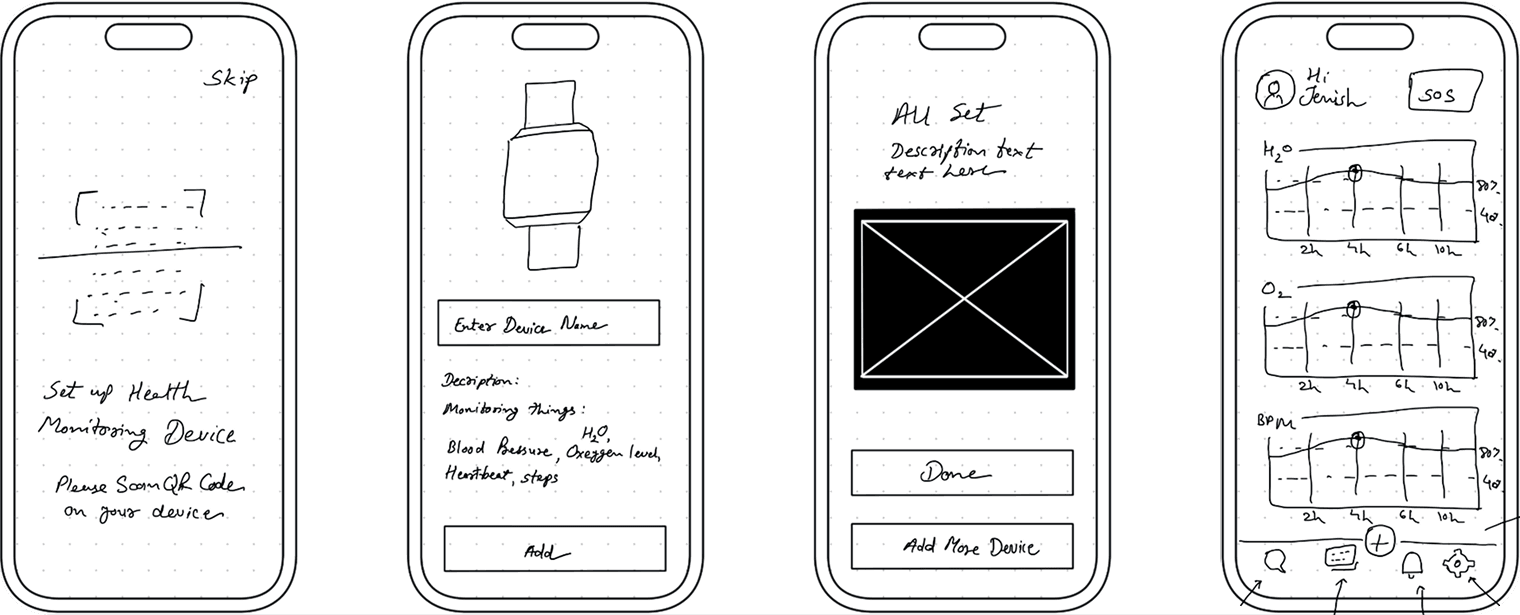
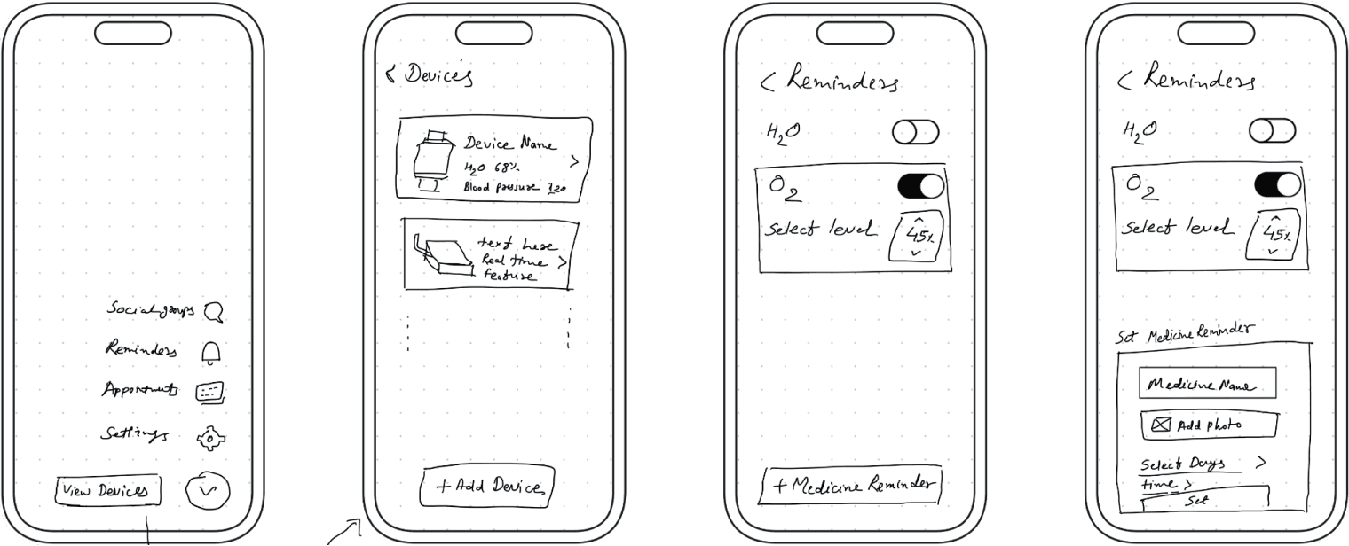
MAJOR DETAILED SCREENS :
Persona :
ui guideline :
developer guideline :
To ensure a smooth design-to-development handoff, I prepared a comprehensive developer guideline package. It outlines component usage, accessibility standards, spacing rules, and interaction patterns to maintain consistency and scalability across the ElderlyCare360 ecosystem.
Deliverables:
Design System: Includes typography, color palette (WCAG AA compliant), buttons, input fields, icons, and states (hover, active, disabled)
Component Library: Figma components with variants for reuse and responsiveness
Spacing & Layout Grid: 8pt spacing system and mobile/tablet breakpoint rules
Interaction Specs: Micro-interactions for buttons, loading states, modals, and alerts
Accessibility Guidelines: Minimum 16pt body text, colour contrast ratio ≥ 4.5:1, large touch targets (44x44px), voice support indicators
Assets: Export-ready SVGs and icons, named and grouped in dev-friendly layers
Annotated Screens: Clear notes on functionality, API triggers (for health data), and navigation flow
Handoff Tools
Figma Developer Mode with organized file structure
PDF design style guide
Slack for clarification
app icon design :
testing and iteration :
We conducted usability testing with a group of elderly users (ages 68–82) and caregivers to validate the design, uncover usability issues, and gather direct feedback. Observations and usability metrics helped shape key improvements in accessibility, navigation, and clarity.
Testing Insights
“I like that it reminds me, but I wish it talked to me—I don’t always see the screen.”
“Buttons at the top are hard to reach on my phone.”
“It should be in my language. Not all my friends read English well.”
“The red button made me feel safe—I knew what to press.”
Key iterations based on feedback:
Added Voice Support: Enabled spoken instructions and alerts for visually impaired users.
Switched to Bottom Navigation: Moved key navigation from top to bottom for thumb-friendly access on mobile.
Persistent SOS Button: Made the emergency button visible across all screens with red colouring for quick identification.
Included Multilingual Support: Added options for multiple languages (starting with English, Hindi, and Mandarin) to support diverse users.
what i learned :
Designing for elderly users taught me that accessibility is not a feature - it’s a requirement.
Small details like icon size, error prevention, and content tone make a big difference.
Testing early helped reduce friction and clarify priorities.
Communication between elderly users and caregivers must be seamless, empathetic, and secure.
Thank you
Let’s build something thoughtful together.
More Projects
Case Study
Humber Current
A celebration of Talent. Humber-Current is platform to build initial connections between students or alumni and industry leading professionals of their domain.
Sprint
Toronto Zoo - Nav
Improve navigation clarity, support key business goals (ticket sales, donations), and enhance user experience.
Load More
Case Study
ElderlyCare 360
ElderlyCare360 is a digital ecosystem designed to support the health, independence, and well-being of elderly users by connecting them with caregivers, doctors, and emergency services all in one place.
Role :
UX Designer
Tools Used :
Figma, FigJam, Slack
Platform :
Mobile (iOS & Android), Tablet
Design Focus Areas :
Accessibility, Health Monitoring, Medication Reminders, Telehealth, Emergency Response, Social Engagement
Problem :
Aging individuals face growing challenges in maintaining physical and mental health, staying connected, managing medications, and accessing healthcare. Caregivers often struggle with managing care from afar while ensuring the safety and well-being of their loved ones.
Solution :
ElderlyCare360 is a comprehensive digital ecosystem built for elderly individuals and their caregivers. It includes health monitoring, medication reminders, virtual healthcare, emergency alerts, and social engagement—all within a user-friendly mobile app interface tailored for accessibility.
Process :
I applied a full-cycle UX design process to create an intuitive and inclusive solution:
I designed with real empathy—testing early, iterating quickly, and building with accessibility in mind to serve one of the most underrepresented user groups.
Research: Interviews and surveys with 30+ seniors and caregivers
Define: Pain points, personas, and user journey mapping
Ideate: Feature brainstorming, IA planning, sketching flows
Prototype: Wireframes to hi-fi interactive prototypes in Figma
Test & Iterate: Usability testing + feedback-driven refinements
Persona :
journey map :
Paper SKetches :
From paper to digital :
mid-fidelity wireframes :
MAJOR DETAILED SCREENS :
Persona :
ui guideline :
developer guideline :
To ensure a smooth design-to-development handoff, I prepared a comprehensive developer guideline package. It outlines component usage, accessibility standards, spacing rules, and interaction patterns to maintain consistency and scalability across the ElderlyCare360 ecosystem.
Deliverables:
Design System: Includes typography, color palette (WCAG AA compliant), buttons, input fields, icons, and states (hover, active, disabled)
Component Library: Figma components with variants for reuse and responsiveness
Spacing & Layout Grid: 8pt spacing system and mobile/tablet breakpoint rules
Interaction Specs: Micro-interactions for buttons, loading states, modals, and alerts
Accessibility Guidelines: Minimum 16pt body text, colour contrast ratio ≥ 4.5:1, large touch targets (44x44px), voice support indicators
Assets: Export-ready SVGs and icons, named and grouped in dev-friendly layers
Annotated Screens: Clear notes on functionality, API triggers (for health data), and navigation flow
Handoff Tools
Figma Developer Mode with organized file structure
PDF design style guide
Slack for clarification
app icon design :
testing and iteration :
We conducted usability testing with a group of elderly users (ages 68–82) and caregivers to validate the design, uncover usability issues, and gather direct feedback. Observations and usability metrics helped shape key improvements in accessibility, navigation, and clarity.
Testing Insights
“I like that it reminds me, but I wish it talked to me—I don’t always see the screen.”
“Buttons at the top are hard to reach on my phone.”
“It should be in my language. Not all my friends read English well.”
“The red button made me feel safe—I knew what to press.”
Key iterations based on feedback:
Added Voice Support: Enabled spoken instructions and alerts for visually impaired users.
Switched to Bottom Navigation: Moved key navigation from top to bottom for thumb-friendly access on mobile.
Persistent SOS Button: Made the emergency button visible across all screens with red colouring for quick identification.
Included Multilingual Support: Added options for multiple languages (starting with English, Hindi, and Mandarin) to support diverse users.
what i learned :
Designing for elderly users taught me that accessibility is not a feature - it’s a requirement.
Small details like icon size, error prevention, and content tone make a big difference.
Testing early helped reduce friction and clarify priorities.
Communication between elderly users and caregivers must be seamless, empathetic, and secure.
Thank you
Let’s build something thoughtful together.
More Projects
Case Study
Humber Current
A celebration of Talent. Humber-Current is platform to build initial connections between students or alumni and industry leading professionals of their domain.
Sprint
Toronto Zoo - Nav
Improve navigation clarity, support key business goals (ticket sales, donations), and enhance user experience.