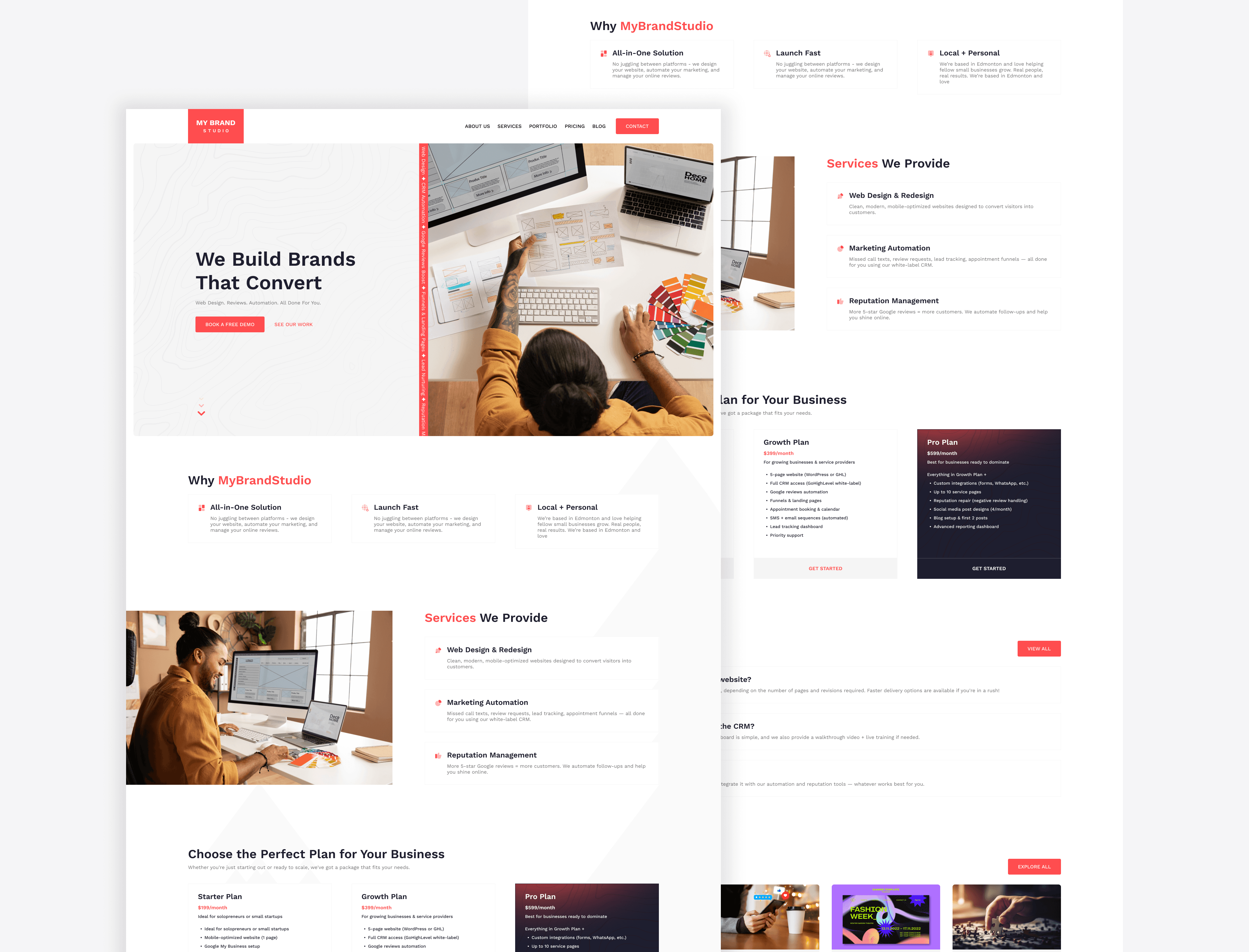
Case Study
humber current
A celebration of Talent. Humber-Current is platform to build initial connections between students or alumni and industry leading professionals of their domain.
Role :
UX Designer
Tools Used :
Figma, Slack
Platform :
Mobile, Web
Design Focus Areas :
Portfolio Discovery, User Navigation, Accessibility, Search & Filtering, Responsive Design, Alumni Connectivity
Problem :
Graduating students from Humber’s Faculty of Media and Creative Arts lacked a centralized, user-friendly platform to showcase their portfolios and connect with peers, alumni, and industry professionals. Users including students, alumni, and recruiters needed a website that was:
Easy to navigate
Inclusive and accessible
Informative about alumni career paths
Supportive of networking and discovery

goal :
To design an intuitive portfolio experience that connects students and alumni while offering recruiters a clear, efficient way to explore Humber talent.
Research & Insights :
User Needs
From initial discussions and stakeholder analysis, we learned that users expected:
A simple, navigable interface with minimal learning curve
Access to alumni portfolios, career paths, and contact links
An accessible platform for users with disabilities
Direct networking opportunities like directories and events
Keyword Research (SEO Focus)
Short-Tail Keywords:Humber current, Humber alumni, Humber students, Portfolios, Careers, Art direction, Public relations
Mid-/Long-Tail Keywords:Humber alumni job portal, Humber alumni portfolios, Public relations alumni, Art direction alumni
These keywords informed our content structure and made the platform search-friendly for both recruiters and students.
design process :
1. Research & Discovery
Conducted user surveys and interviews with Humber students
Identified key pain points: scattered communication, missed deadlines, lack of campus connection
2. Define & Analyze
Created user personas, empathy maps, and journey maps
Prioritized features based on student needs and institutional goals
3. Ideation & Wireframing
Sketched low-fidelity wireframes
Explored layout variations focused on simplicity and clarity
Mapped user flows for key actions (e.g., checking deadlines, discovering events)
4. Design & Prototyping
Built high-fidelity UI in Figma with a modern, student-friendly aesthetic
Applied accessibility principles (contrast, font size, icon clarity)
Created an interactive prototype for testing
5. Testing & Iteration
Ran usability tests with real students
Key changes: added persistent reminders, reorganized event discovery, improved dashboard clarity
6. Developer Handoff
Provided detailed design specs, style guides, and interaction notes
Ensured collaborative feedback loop with developers during build phase
Persona :
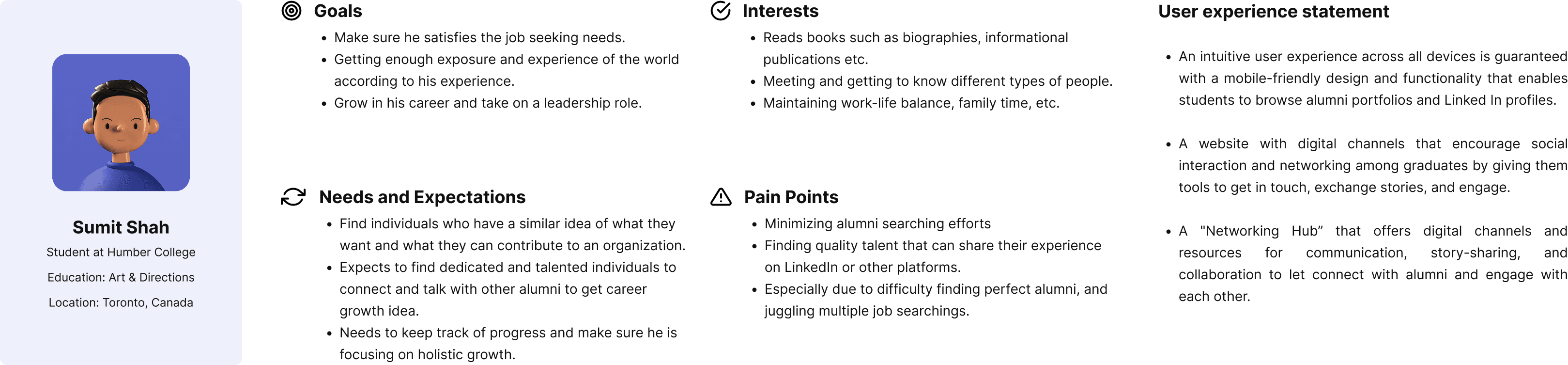
user survey insights :
To better understand user expectations, I conducted a short survey targeting Humber students and alumni. The goal was to gather insights on how they search for portfolios and what features they value most.
Participants:
12 users (8 students, 3 alumni, 1 faculty member)
Key Findings:
92% preferred a simple, no-login browsing experience
83% wanted filters by department or program
75% were unsure what “Humber Current” referred to without context
100% agreed that visual previews (thumbnails) improved portfolio discovery
60% mentioned mobile access as a priority
These insights directly influenced decisions around navigation, labeling, homepage content, and search/filter placement.
empathy map :
To deeply understand the students' needs, frustrations, and motivations, I conducted interviews and surveys with Humber students from diverse programs and years. The goal was to step into their shoes and identify the everyday pain points they face while navigating campus life and academic responsibilities.
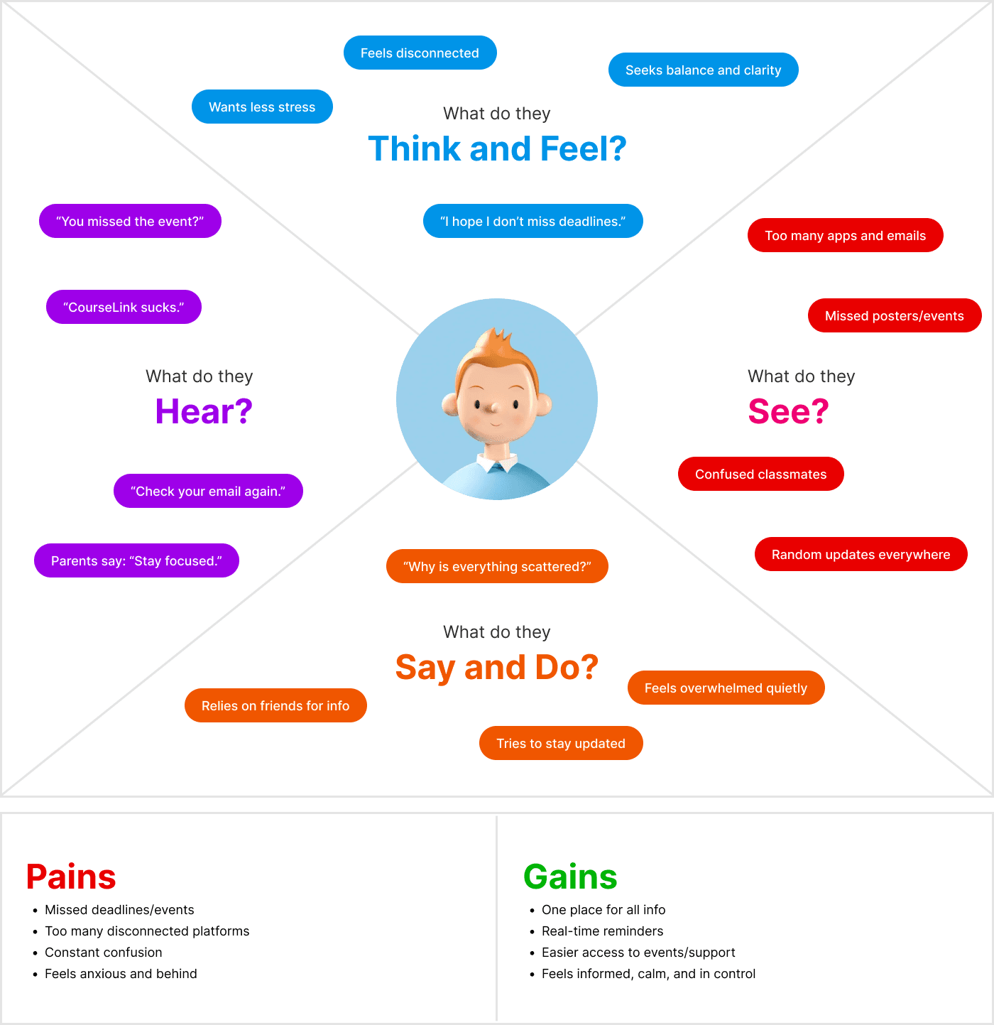
Empathy Takeaway:
Students crave clarity, connection, and convenience. They want one go-to place to manage academics, explore campus events, and feel a sense of belonging — not just another app, but a digital companion that simplifies student life.
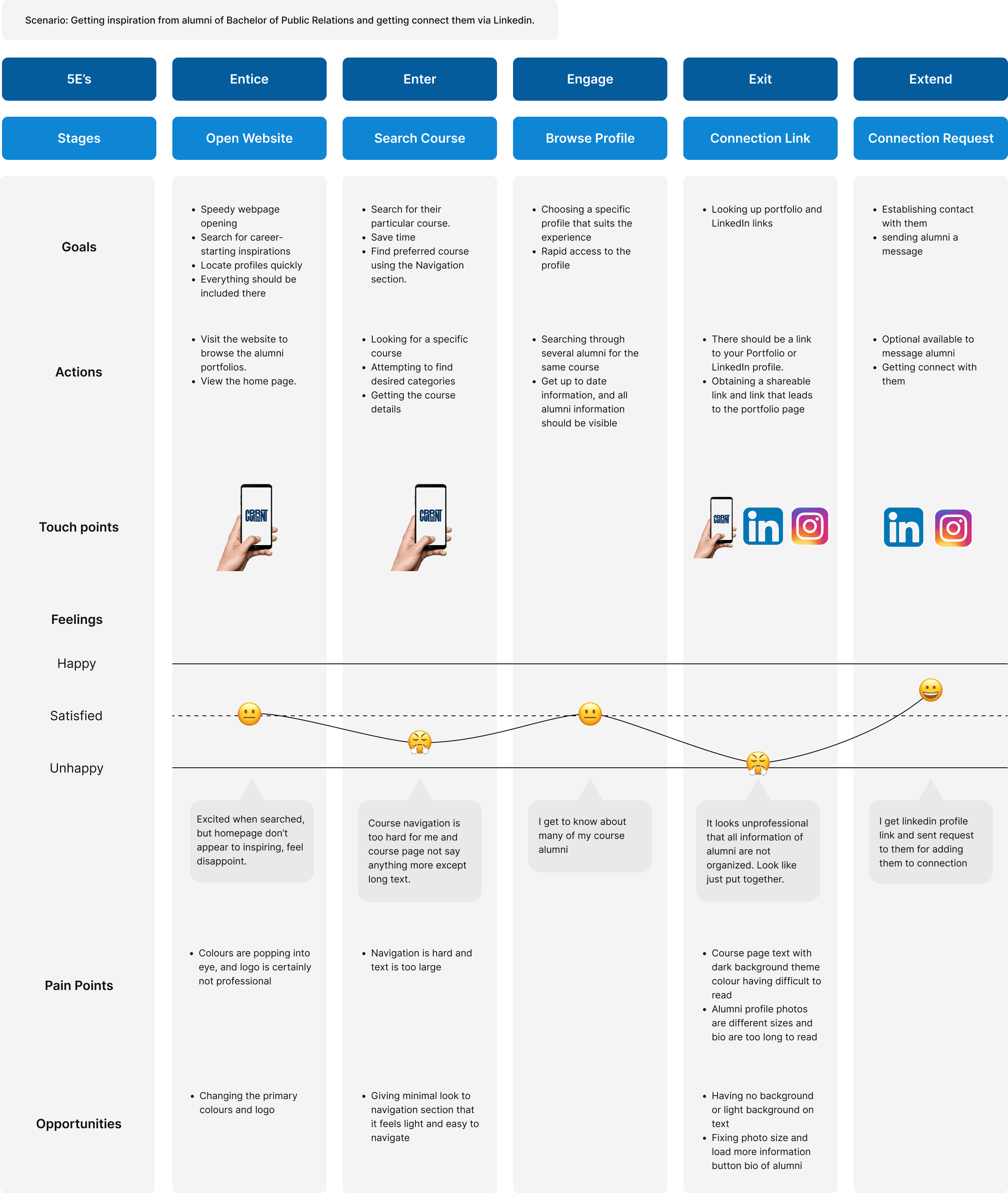
journey map :
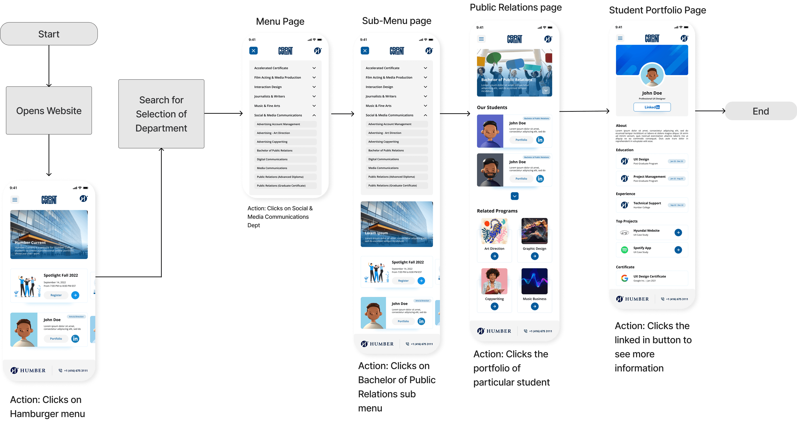
task flow :
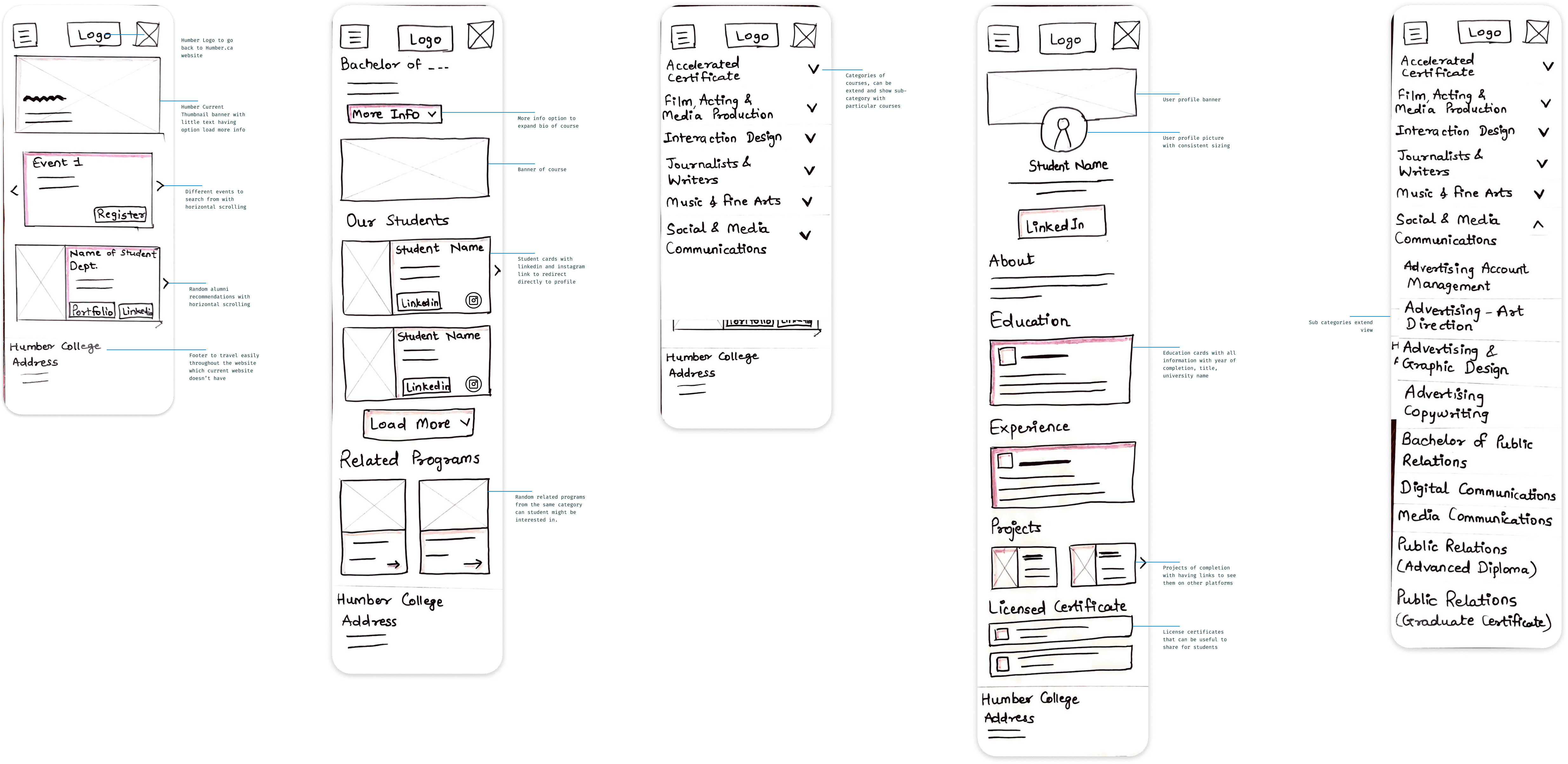
low-fidelity sketch :
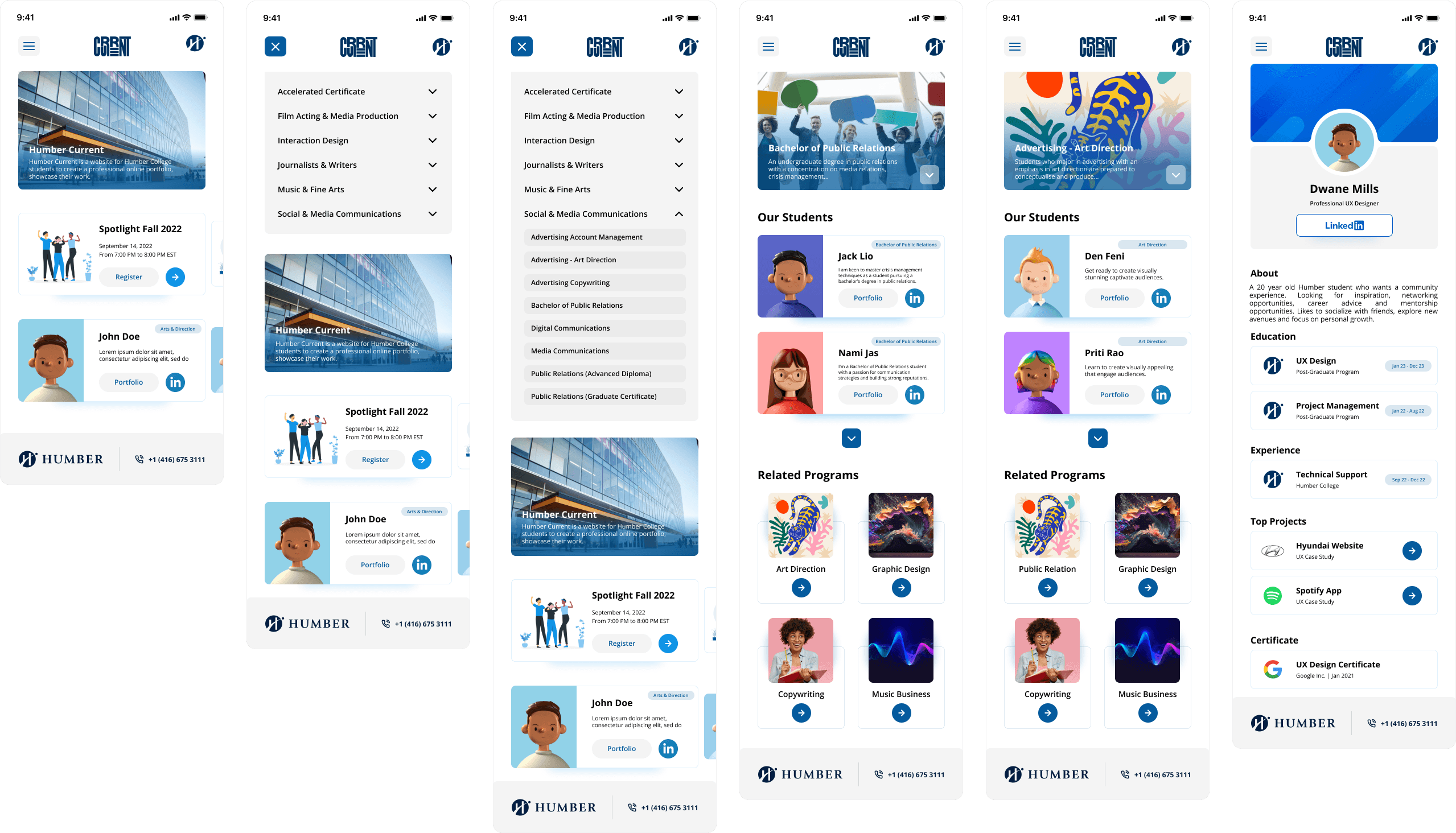
hi-fidelity design :
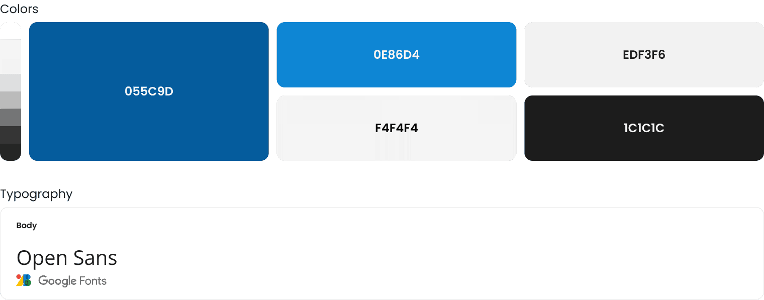
ui guideline :
developer handoff :
To ensure a smooth implementation, I prepared a clean, developer-friendly Figma file with:
Organized components using Auto Layout Clear naming, styles, and design tokens Variants for hover, active, and responsive states Annotations for key interactions and accessibility guidelines
I also provided a quick walkthrough, answered implementation questions, and stayed available for feedback during development.
what i learned :
Designing for elderly users taught me that accessibility is not a feature - it’s a requirement.
Small details like icon size, error prevention, and content tone make a big difference.
Testing early helped reduce friction and clarify priorities.
Communication between elderly users and caregivers must be seamless, empathetic, and secure.

Thank you
Let’s build something thoughtful together.
Case Study
humber current
A celebration of Talent. Humber-Current is platform to build initial connections between students or alumni and industry leading professionals of their domain.
Role :
UX Designer
Tools Used :
Figma, Slack
Platform :
Mobile, Web
Design Focus Areas :
Portfolio Discovery, User Navigation, Accessibility, Search & Filtering, Responsive Design, Alumni Connectivity
Problem :
Graduating students from Humber’s Faculty of Media and Creative Arts lacked a centralized, user-friendly platform to showcase their portfolios and connect with peers, alumni, and industry professionals. Users including students, alumni, and recruiters needed a website that was:
Easy to navigate
Inclusive and accessible
Informative about alumni career paths
Supportive of networking and discovery
goal :
To design an intuitive portfolio experience that connects students and alumni while offering recruiters a clear, efficient way to explore Humber talent.
Research & Insights :
User Needs
From initial discussions and stakeholder analysis, we learned that users expected:
A simple, navigable interface with minimal learning curve
Access to alumni portfolios, career paths, and contact links
An accessible platform for users with disabilities
Direct networking opportunities like directories and events
Keyword Research (SEO Focus)
Short-Tail Keywords:Humber current, Humber alumni, Humber students, Portfolios, Careers, Art direction, Public relations
Mid-/Long-Tail Keywords:Humber alumni job portal, Humber alumni portfolios, Public relations alumni, Art direction alumni
These keywords informed our content structure and made the platform search-friendly for both recruiters and students.
design process :
1. Research & Discovery
Conducted user surveys and interviews with Humber students
Identified key pain points: scattered communication, missed deadlines, lack of campus connection
2. Define & Analyze
Created user personas, empathy maps, and journey maps
Prioritized features based on student needs and institutional goals
3. Ideation & Wireframing
Sketched low-fidelity wireframes
Explored layout variations focused on simplicity and clarity
Mapped user flows for key actions (e.g., checking deadlines, discovering events)
4. Design & Prototyping
Built high-fidelity UI in Figma with a modern, student-friendly aesthetic
Applied accessibility principles (contrast, font size, icon clarity)
Created an interactive prototype for testing
5. Testing & Iteration
Ran usability tests with real students
Key changes: added persistent reminders, reorganized event discovery, improved dashboard clarity
6. Developer Handoff
Provided detailed design specs, style guides, and interaction notes
Ensured collaborative feedback loop with developers during build phase
Persona :
user survey insights :
To better understand user expectations, I conducted a short survey targeting Humber students and alumni. The goal was to gather insights on how they search for portfolios and what features they value most.
Participants:
12 users (8 students, 3 alumni, 1 faculty member)
Key Findings:
92% preferred a simple, no-login browsing experience
83% wanted filters by department or program
75% were unsure what “Humber Current” referred to without context
100% agreed that visual previews (thumbnails) improved portfolio discovery
60% mentioned mobile access as a priority
These insights directly influenced decisions around navigation, labeling, homepage content, and search/filter placement.
empathy map :
To deeply understand the students' needs, frustrations, and motivations, I conducted interviews and surveys with Humber students from diverse programs and years. The goal was to step into their shoes and identify the everyday pain points they face while navigating campus life and academic responsibilities.
Empathy Takeaway:
Students crave clarity, connection, and convenience. They want one go-to place to manage academics, explore campus events, and feel a sense of belonging — not just another app, but a digital companion that simplifies student life.
journey map :
task flow :
low-fidelity sketch :
hi-fidelity design :
ui guideline :
developer handoff :
To ensure a smooth implementation, I prepared a clean, developer-friendly Figma file with:
Organized components using Auto Layout Clear naming, styles, and design tokens Variants for hover, active, and responsive states Annotations for key interactions and accessibility guidelines
I also provided a quick walkthrough, answered implementation questions, and stayed available for feedback during development.
what i learned :
Designing for elderly users taught me that accessibility is not a feature - it’s a requirement.
Small details like icon size, error prevention, and content tone make a big difference.
Testing early helped reduce friction and clarify priorities.
Communication between elderly users and caregivers must be seamless, empathetic, and secure.
Thank you
Let’s build something thoughtful together.