Sprint
toronto zoo - nav
Improve navigation clarity, support key business goals (ticket sales, donations), and enhance user experience.
Role :
UX Designer
Tools Used :
Figma, FigJam, Slack
Platform :
Mobile (iOS & Android), Tablet
Design Focus Areas :
Navigation Clarity, Business Goal Support, User Centered Content, Mobile-Friendly Structure, Content Hierarchy & Visual Reinforcement
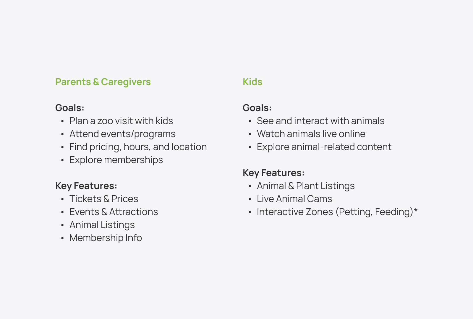
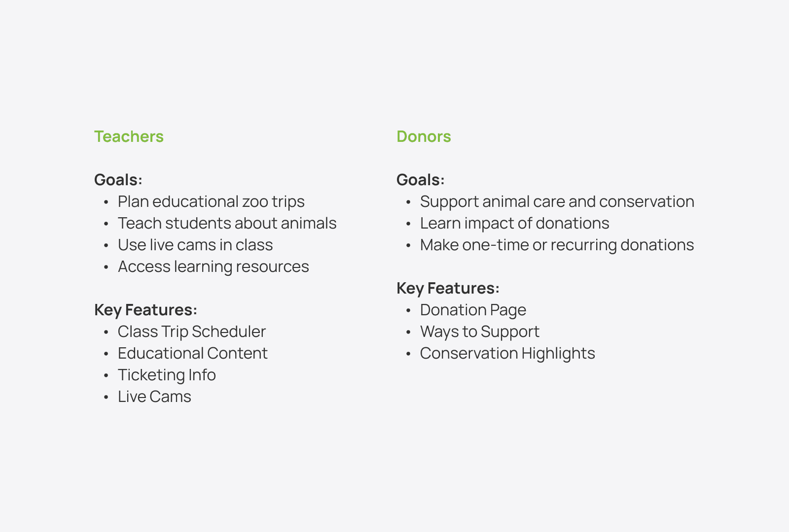
user types & goals :
Understanding our diverse user base helped shape the structure, content, and navigation of the redesigned Toronto Zoo website. Each group had distinct goals that informed feature prioritization.
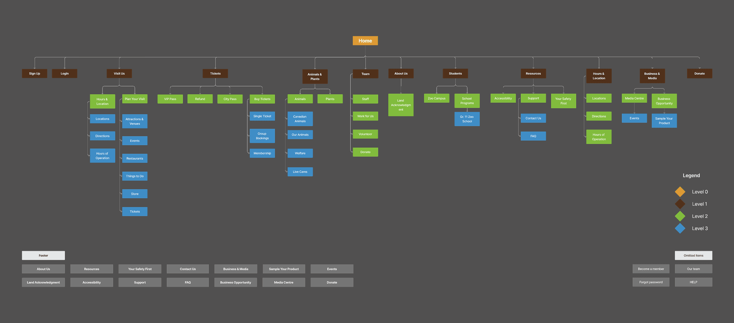
initial Information architecture site map :
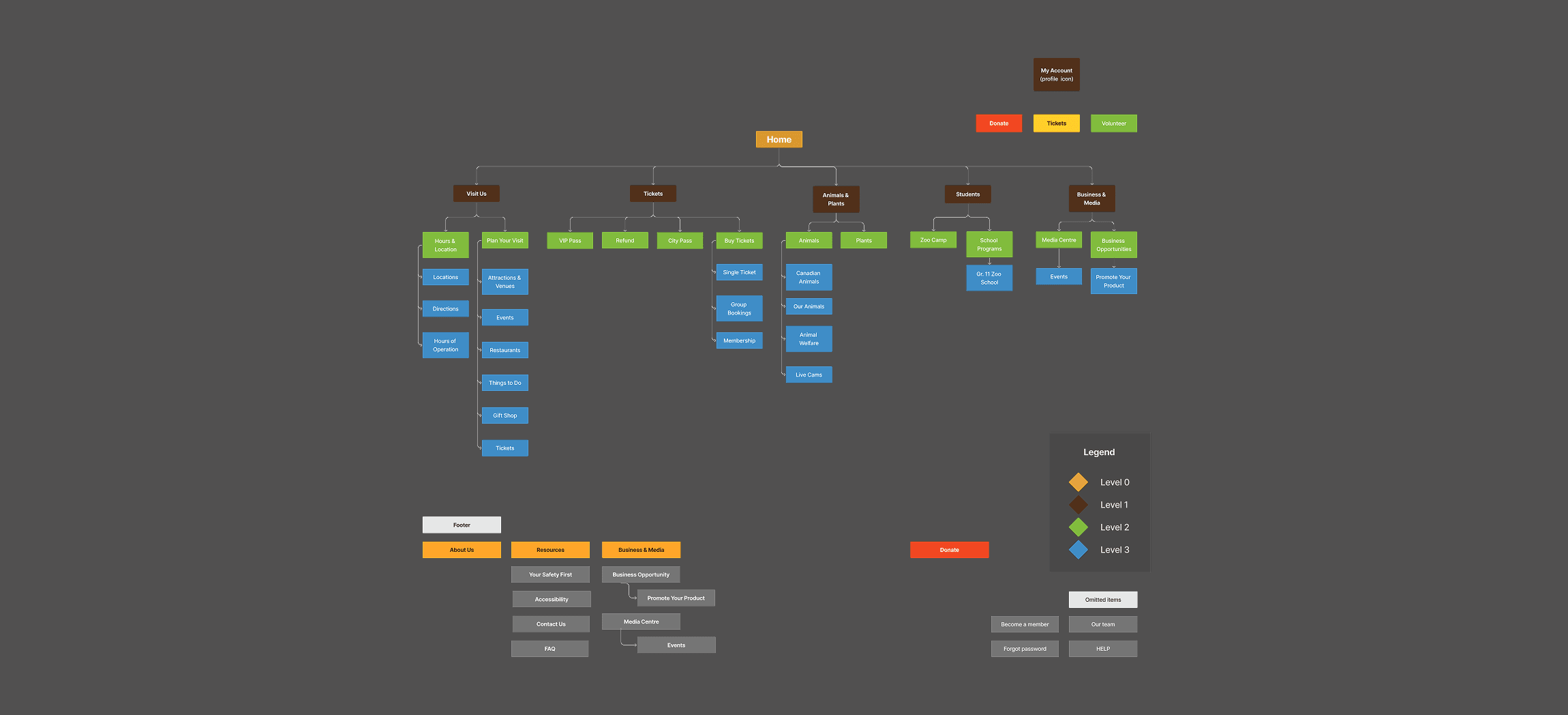
final Information architecture site map :
labeling :
Store was changed to Gift Shop to clarify that the page is about the Boutiques and Gift Shops at the Toronto Zoo, not an online store to buy merchandise.
Welfare was changed to Animal Welfare to enhance clarity.
Sample Your Product was changed to Promote Your Product to better suit what the page was about– a business opportunity to promote products at the Zoo.
Login and Sign-Up were changed to become My Account to remove the need for a separate pages and replace it with a label that users would be equally familiar with.
CityPass, Membership and Live Cams were found to be confusing, but we elected to leave their labels as is and clarify them through their placement in our navigation design.

duplication & omitted cards :
In order to recruit more donors, we thought it would be helpful to feature Donate twice.
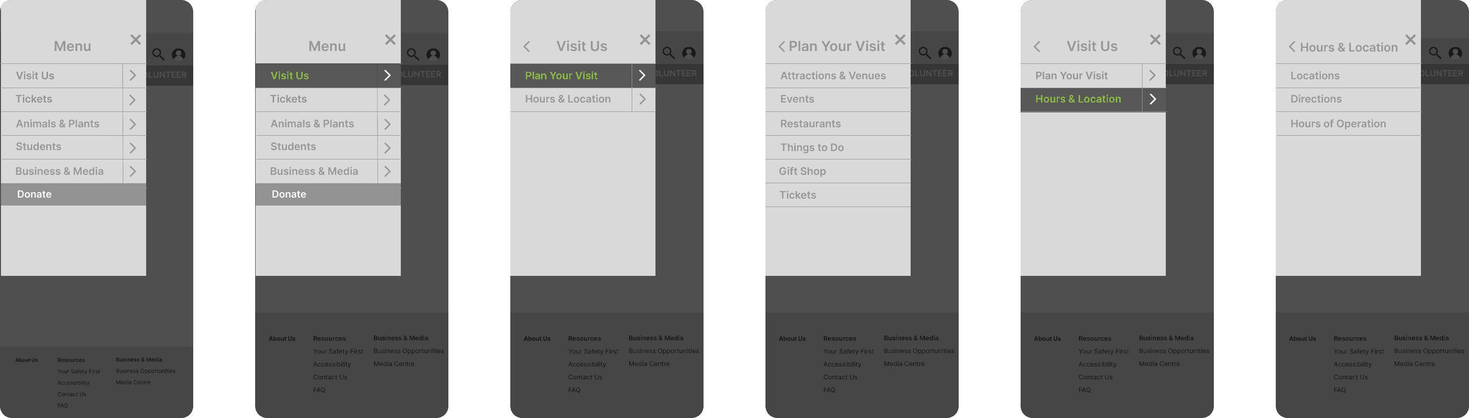
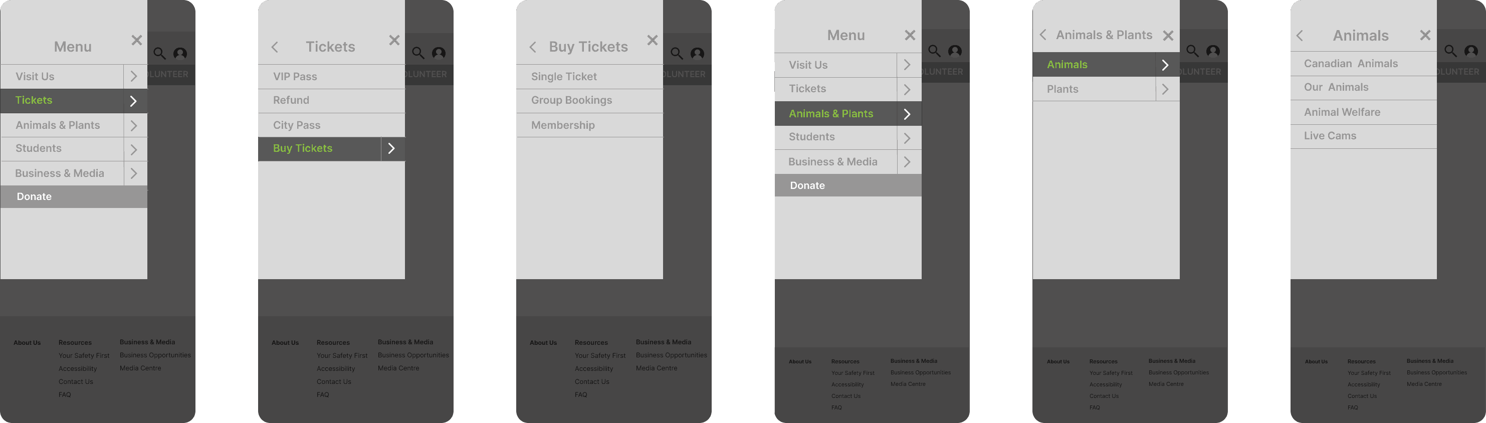
Tickets were repeated three times throughout the designs to support the business goal of increasing revenue.
We repeated Hours & Location in the header as well as within the Visit Us category.
Land Acknowledgement was removed as it would likely not be a primary target for users.
Hours and Location was moved to be under Plan Your Visit as we felt most users would be interested in finding these when they are planning their trip to the zoo.
We removed Support as we have already highlighted volunteering and donating in other prominent areas of the website.
mobile nav :
website nav :
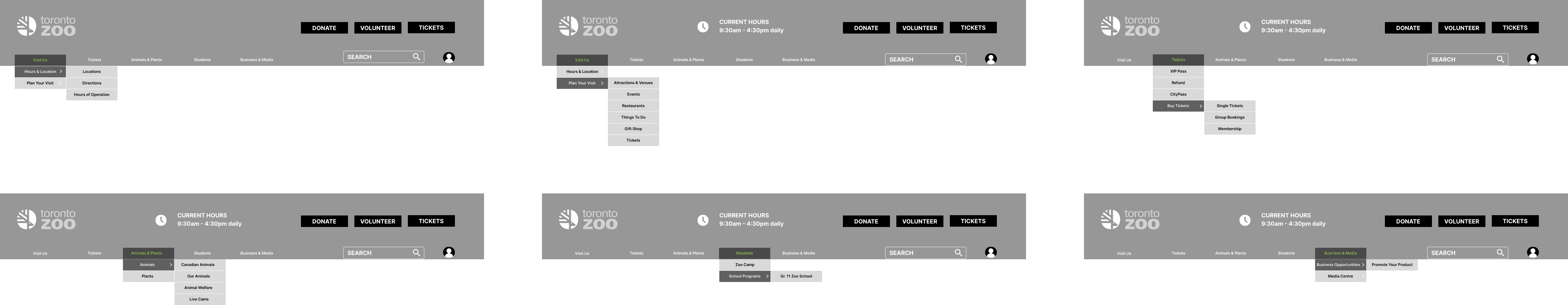
business goal support :
Increased visibility of high-priority actions: Buy Tickets, Donate, Become a Member
Strategically repeated key CTAs across the site to improve conversion paths
Clarified promotional opportunities for businesses with clearer language
what i learned :
Working on the Toronto Zoo nav-redesign was a deep dive into balancing user needs with institutional goals. It strengthened my ability to simplify complex navigation structures while maintaining a user-first mindset.
Key Learnings:
Clarity beats cleverness : Users value straightforward labels over catchy or vague terms.
Content placement matters : Strategic repetition of high-priority items like Tickets and Donate increased visibility and supported business goals.
Navigation is more than structure : Labeling, hierarchy, and grouping all shape how users find their way.
Design for multiple audiences : Catering to kids, parents, teachers, donors, and media required thoughtful prioritization and content mapping.
Collaboration is key : Clear communication with stakeholders and developers was crucial during content rationalization and handoff.
This project reinforced the power of UX to not just improve usability but to also drive engagement and mission-aligned outcomes.

Thank you
Let’s build something thoughtful together.
More Projects

Case Study
Humber Current
A celebration of Talent. Humber-Current is platform to build initial connections between students or alumni and industry leading professionals of their domain.
Case Study
elderlycare 360
ElderlyCare360 is a digital ecosystem designed to support the health, independence, and well-being of elderly users by connecting them with caregivers, doctors, and emergency services all in one place.
Load More
Sprint
toronto zoo - nav
Improve navigation clarity, support key business goals (ticket sales, donations), and enhance user experience.
Role :
UX Designer
Tools Used :
Figma, FigJam, Slack
Platform :
Mobile (iOS & Android), Tablet
Design Focus Areas :
Navigation Clarity, Business Goal Support, User Centered Content, Mobile-Friendly Structure, Content Hierarchy & Visual Reinforcement
user types & goals :
Understanding our diverse user base helped shape the structure, content, and navigation of the redesigned Toronto Zoo website. Each group had distinct goals that informed feature prioritization.
initial Information architecture site map :
final Information architecture site map :
labeling :
Store was changed to Gift Shop to clarify that the page is about the Boutiques and Gift Shops at the Toronto Zoo, not an online store to buy merchandise.
Welfare was changed to Animal Welfare to enhance clarity.
Sample Your Product was changed to Promote Your Product to better suit what the page was about– a business opportunity to promote products at the Zoo.
Login and Sign-Up were changed to become My Account to remove the need for a separate pages and replace it with a label that users would be equally familiar with.
CityPass, Membership and Live Cams were found to be confusing, but we elected to leave their labels as is and clarify them through their placement in our navigation design.
duplication & omitted cards :
In order to recruit more donors, we thought it would be helpful to feature Donate twice.
Tickets were repeated three times throughout the designs to support the business goal of increasing revenue.
We repeated Hours & Location in the header as well as within the Visit Us category.
Land Acknowledgement was removed as it would likely not be a primary target for users.
Hours and Location was moved to be under Plan Your Visit as we felt most users would be interested in finding these when they are planning their trip to the zoo.
We removed Support as we have already highlighted volunteering and donating in other prominent areas of the website.
mobile nav :
website nav :
business goal support :
Increased visibility of high-priority actions: Buy Tickets, Donate, Become a Member
Strategically repeated key CTAs across the site to improve conversion paths
Clarified promotional opportunities for businesses with clearer language
what i learned :
Working on the Toronto Zoo nav-redesign was a deep dive into balancing user needs with institutional goals. It strengthened my ability to simplify complex navigation structures while maintaining a user-first mindset.
Key Learnings:
Clarity beats cleverness : Users value straightforward labels over catchy or vague terms.
Content placement matters : Strategic repetition of high-priority items like Tickets and Donate increased visibility and supported business goals.
Navigation is more than structure : Labeling, hierarchy, and grouping all shape how users find their way.
Design for multiple audiences : Catering to kids, parents, teachers, donors, and media required thoughtful prioritization and content mapping.
Collaboration is key : Clear communication with stakeholders and developers was crucial during content rationalization and handoff.
This project reinforced the power of UX to not just improve usability but to also drive engagement and mission-aligned outcomes.
Thank you
Let’s build something thoughtful together.
More Projects
Case Study
Humber Current
A celebration of Talent. Humber-Current is platform to build initial connections between students or alumni and industry leading professionals of their domain.
Case Study
elderlycare 360
ElderlyCare360 is a digital ecosystem designed to support the health, independence, and well-being of elderly users by connecting them with caregivers, doctors, and emergency services all in one place.